Introduction to the ngramr.plus R package
Load the ngramr.plus package
Load the package, as well as others that we’ll use in this vignette.
library(ngramr.plus)
library(tidyverse)
Retrieving data
Running the functions is straightforward, but remember that it can take a couple minutes if your are loading one of the larger Google Books data tables. Here we return counts of zinger by year from the data tables for US English.
z_year <- google_ngram(word_forms = "zinger", variety = "us", by = "year")
Check the data:
Year |
AF |
Total |
Per_10.6 |
|---|---|---|---|
1834 |
3 |
160777483 |
0.0186593 |
1835 |
3 |
213225556 |
0.0140696 |
1837 |
1 |
178891779 |
0.0055900 |
1857 |
3 |
426434283 |
0.0070351 |
1859 |
1 |
442579354 |
0.0022595 |
1860 |
2 |
455087035 |
0.004394 |
In current usage, zinger denotes a kind of cutting quip. Its supposed origin is as a baseball term that becomes generalized in the middle of the 20th century. Does this explanation comport with the data?
Plot the data
To partly answer such a question, we can plot the data:
  ggplot(z_year %>% filter(Year > 1799), aes(x=Year, y=Per_10.6)) +
    geom_point(size = .5) +
    geom_smooth(method = "gam", formula = y ~ s(x, bs = "cs"), size=.25) +
    labs(x="year", y = "frequency (per million words)")+
    theme(panel.grid.minor.x=element_blank(),
          panel.grid.major.x=element_blank()) +
    theme(panel.grid.minor.y =   element_blank(),
          panel.grid.major.y =   element_line(colour = "gray",size=0.25)) +
    theme(rect = element_blank()) +
    theme(legend.title=element_blank()) +
    theme(axis.title = element_text(family = "Arial", color="#666666", face="bold", size=10))
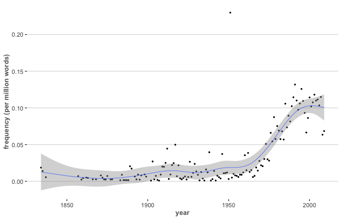
There does appear to be some circulation prior to the mid-20th century. To explain that, we can look at the underlying texts in Google Books.
By decade
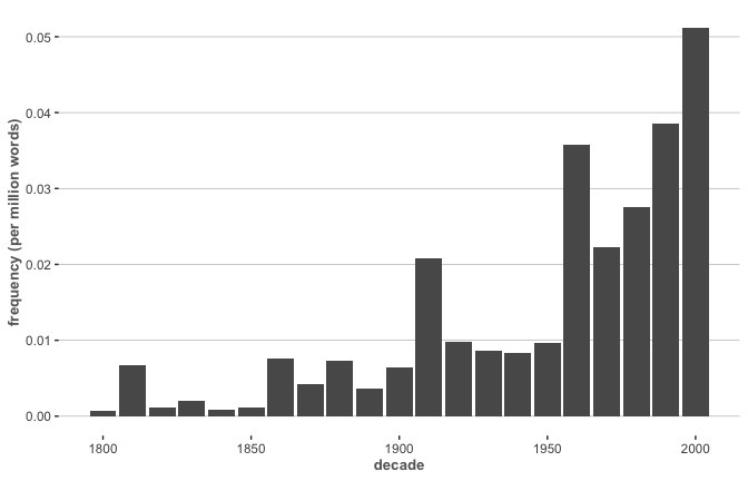
Next, we’ll return counts of zinger and zingers by decade from the data tables for British English.
z_decade <- google_ngram(word_forms = c("zinger", "zingers"), variety = "gb", by = "decade")
Check the data:
Decade |
AF |
Total |
Per_10.6 |
|---|---|---|---|
1780 |
2 |
374630337 |
0.0053386 |
1800 |
1 |
1302698028 |
0.0007676 |
1810 |
12 |
1802397035 |
0.0066578 |
1820 |
3 |
2558079128 |
0.0011728 |
1830 |
6 |
2954836522 |
0.0020306 |
1840 |
3 |
3547747138 |
0.0008456 |
Ploting the data
Now we can filter and plot our by-decade data:
ggplot(z_decade %>% filter(Decade > 1799), aes(x=Decade, y=Per_10.6)) +
  geom_bar(stat = "identity") +
  labs(x="decade", y = "frequency (per million words)")+
  theme(panel.grid.minor.x=element_blank(),
         panel.grid.major.x=element_blank()) +
  theme(panel.grid.minor.y =   element_blank(),
        panel.grid.major.y =   element_line(colour = "gray",size=0.25)) +
  theme(rect = element_blank()) +
  theme(legend.title=element_blank()) +
  theme(axis.title = element_text(family = "Arial", color="#666666", face="bold", size=10))
Bibliography
Michel, Jean-Baptiste, Yuan Kui Shen, Aviva Presser Aiden, Adrian Veres, Matthew K Gray, Joseph P Pickett, Dale Hoiberg, et al. 2011. “Quantitative Analysis of Culture Using Millions of Digitized Books.” Science 331 (6014): 176–82. https://science.sciencemag.org/content/331/6014/176.