Introduction to the vnc R package
Load the vnc package
Load the package, as well as others that we’ll use in this vignette.
library(vnc)
library(tidyverse)
library(dendextend)
library(ggdendro)
Check the data
Let’s begin by looking at the frequencies of the bigram witch hunt and the plural witch hunts, which are available in the package data and come from Google Books.
knitr::kable(witch_hunt, caption = "Data included with vnc package")
decade |
token_count |
total_count |
counts_permil |
|---|---|---|---|
1600 |
3 |
1585485 |
1.89 |
1680 |
1 |
1945902 |
0.51 |
1810 |
4 |
499552970 |
0.01 |
1860 |
1 |
3247012381 |
0.00 |
1880 |
2 |
6267570245 |
0.00 |
1890 |
4 |
8293033235 |
0.00 |
1900 |
26 |
11103867317 |
0.00 |
1910 |
21 |
11777942915 |
0.00 |
1920 |
55 |
9964203621 |
0.01 |
1930 |
199 |
9067323416 |
0.02 |
1940 |
948 |
9673970472 |
0.10 |
1950 |
2639 |
13293905516 |
0.20 |
1960 |
3906 |
23660378418 |
0.17 |
1970 |
6379 |
29211995598 |
0.22 |
1980 |
6786 |
36463128334 |
0.19 |
1990 |
15064 |
58099277939 |
0.26 |
2000 |
29775 |
111276927919 |
0.27 |
Periodization
The purpose of Variability-Based Neighbor Clustering is to divide the use of a word or phrase into historical periods based on changes in frequency. Rather than assuming that a year, decade, or other division is statistically meaningful, the algorithm clusters segments of time into periods.
For this to work, the time data that we input must be evenly spaced. There can’t be any gaps. In the data above, it is clear that there are many missing decades. If we tried to plot the data, a function called is.sequence() would halt the process and produce an error.
vnc_scree(witch_hunt$decade, witch_hunt$counts_permil, distance.measure = "sd")
#> Error in vnc_scree(witch_hunt$decade, witch_hunt$counts_permil, distance.measure = "sd"): It appears that your time series contains gaps or is not evenly spaced.
Preparing the data
To prevent this error, we could fill in missing decades with zero counts. Alternatively, we can select only data from the twentieth century, which is what we will do here.
wh_d <- witch_hunt %>%
  filter(decade > 1899) %>%
  dplyr::select(decade, counts_permil)
Generate a scree plot
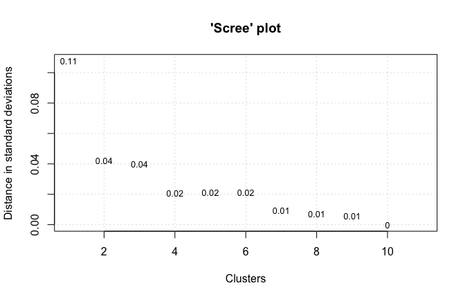
We will use the data to generate a scree plot. The platting function takes a vector of time intervals and a vector of values.
vnc_scree(wh_d$decade, wh_d$counts_permil, distance.measure = "sd")
Generate an hclust object
Next, we can generate an hclust object using the vnc_clust() function. Like the vnc_scree() function, it takes a vector of time intervals and a vector of values.
hc <- vnc_clust(wh_d$decade, wh_d$counts_permil, distance.measure = "sd")
Plot the dendrogram
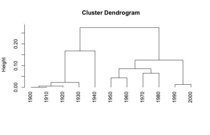
A dendrogram can be plotted from the generated hclust object.
plot(hc, hang = -1)
Cut the dendrogram
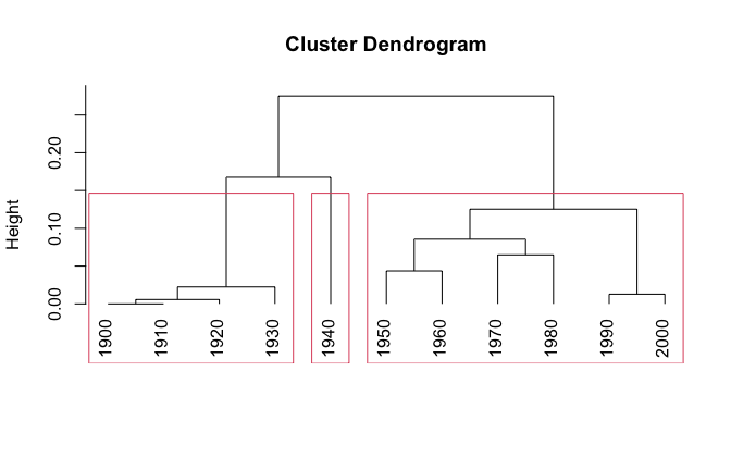
For the next step, we’ll cut the dendrogram into 3 clusters based on the output of the scree plot we that generated. Note that we’re storing the output into an object cut_hc.
plot(hc, hang = -1)
cut_hc <- rect.hclust(hc, k=3)
Prepare data for fancier plotting
We’ve already plotted our data with base R. However, if we want more control, we probably want to use ggplot2. To do that, we need to go through a couple of intermediate steps. First, convert the cut_hc object that we just generated into a data.frame and join that with our original wh_d data.
clust_df <- data.frame(decade=as.numeric(names(unlist(cut_hc))),
  clust=rep(c(paste0("clust_", seq(1:length(cut_hc)))),
  times=sapply(cut_hc,length)))

clust_df <- clust_df %>% right_join(wh_d, by = "decade")
And check the result…
knitr::kable(clust_df)
decade |
clust |
counts_permil |
|---|---|---|
1900 |
clust_1 |
0.00 |
1910 |
clust_1 |
0.00 |
1920 |
clust_1 |
0.01 |
1930 |
clust_1 |
0.02 |
1940 |
clust_2 |
0.10 |
1950 |
clust_3 |
0.20 |
1960 |
clust_3 |
0.17 |
1970 |
clust_3 |
0.22 |
1980 |
clust_3 |
0.19 |
1990 |
clust_3 |
0.26 |
2000 |
clust_3 |
0.27 |
Next, we’ll convert our cluster data into dendrogram data using
as.dendrogram() from ggdendro. We also MUST maintain the order of our time series. There are a variety of ways of doing this, but dendextend
has an easy function called sort(). We’ll take the easy way!
To get ggplot-friendly data, we have to transform it yet again… This time using the ggdendro package’s function dendro_data().
dend <- as.dendrogram(hc) %>% sort
dend_data <- dendro_data(dend, type = "rectangle")
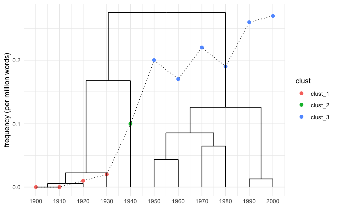
Now let’s do some fancy plotting! We’re going to combine the dendrogram and a time series line plot like Gries and Hilpert do on pg. 140 of their chapter on VNC. The first three lines pull data from clust_df for the line plot using the clusters to color each point according to group. The geom_segment pulls data from dend_data to build the dendrogram. For the tick marks we again pull from dend_data using the x column for the breaks and and the label column to label the breaks.
ggplot(clust_df, aes(x = as.numeric(rownames(clust_df)), y = counts_permil)) +
  geom_line(linetype = "dotted") +
  geom_point(aes(color = clust), size = 2) +
  geom_segment(data = dend_data$segments, aes(x = x, y = y, xend = xend, yend = yend))+
  scale_x_continuous(breaks = dend_data$labels$x,
    labels=as.character(dend_data$labels$label)) +
  xlab("") + ylab("frequency (per million words)") +
  theme_minimal()
Bibliography
Gries, Stefan Th, and Martin Hilpert. 2012. “Variability-Based Neighbor Clustering: A Bottom-up Approach to Periodization in Historical Linguistics.” The Oxford Handbook of the History of English, 134–44. https://www.oxfordhandbooks.com/view/10.1093/oxfordhb/9780199922765.001.0001/oxfordhb-9780199922765-e-14#oxfordhb-9780199922765-div1-50.
Gries, Stefan Th, and Sabine Stoll. 2009. “Finding Developmental Groups in Acquisition Data: Variability-Based Neighbour Clustering.” Journal of Quantitative Linguistics 16 (3): 217–42. https://www.tandfonline.com/doi/abs/10.1080/09296170902975692.
Th. Gries, Stefan, and Martin Hilpert. 2008. “The Identification of Stages in Diachronic Data: Variability-Based Neighbour Clustering.” Corpora 3 (1): 59–81. https://www.euppublishing.com/doi/abs/10.3366/E1749503208000075.